06 Nedbank · Banking
Redesigning digital loan management
Managing a personal loan at Nedbank meant calling the call centre or visiting a branch. We designed a self-service loan hub in the mobile and web apps, and within six months 60% of loan settlements were happening digitally.
- Role
- UX designer, consultant
- Timeline
- 2017 – 2018 (8 months)
- Platform
- Mobile and web
- Audience
- Retail customers with personal loans
Impact
My role
I was a UX designer on Nedbank's digital transformation, where I designed more than 10 features for the Nedbank Money app and web banking and worked with subject matter experts across several countries. The loan hub was part of that work.
The challenge
Calling or visiting a branch to manage a loan was slow, the information was fragmented, and simple questions meant long waits.
Nedbank, one of South Africa's four largest banks, saw a chance to give customers more control through a digital self-service loan hub. Customers told us about:
- No consolidated view of their loan details
- Long waits for simple questions or to request documents
- Having to call or visit a branch to settle a loan or get a statement
- Unclear processes for loan-related actions
Goals
For customers
One intuitive place to manage personal loans, with a clear view of balances and options, building trust through transparency.
For the business
Fewer call centre and branch visits for routine tasks, lower operating costs, and wide adoption of digital loan features.
Research
Research with customers holding active personal loans showed they wanted a single, reliable source of truth for their loan, the ability to act digitally on their own time, and clear, upfront information about amounts, due dates and processes.
Technical constraints
Every design had to integrate with core banking systems and stay secure and compliant.
An opening in the market
Other South African banks offered only limited digital loan management, so doing it well was a chance to lead.
The loan hub
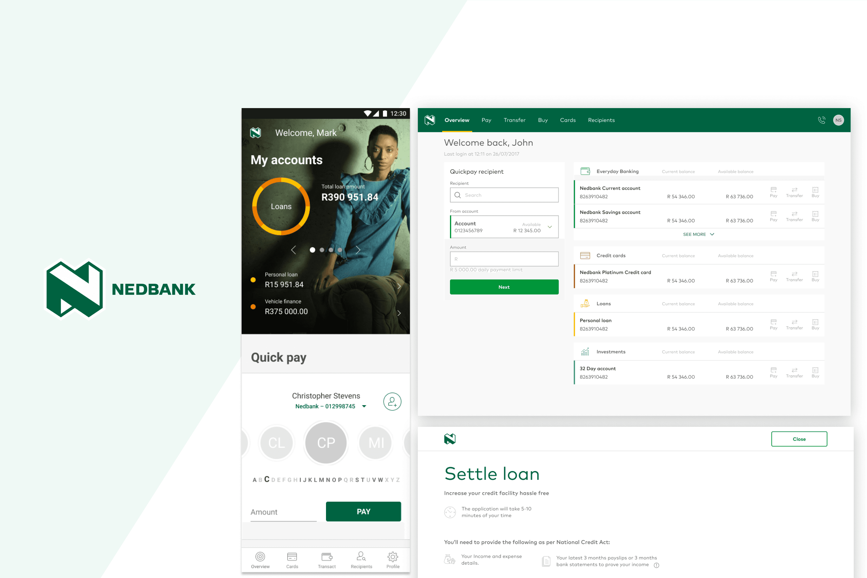
A central Loan Details page became the single access point for everything: an overview dashboard, transaction history, settlement and payment management.
Design decisions
One hub, not scattered features
Customers had no consolidated view, so every loan detail and action lives in one easy-to-reach section of the app.
Clarity before detail
Balances and payment schedules are shown visually, with plain-language labels instead of banking terms.
Guide the high-stakes actions
Settlement is the action customers used to phone in for, so it became a step-by-step wizard that builds confidence.
Make the next step obvious
Primary actions are prominent and easy to find, so routine tasks no longer need a call.
Results
Customers moved from call to click.
- 60% of loan settlements were processed digitally within six months.
- Call centre enquiries about loan management dropped substantially.
- Customer satisfaction and loyalty scores for digital banking improved.
- Customers valued 24/7 access and being able to act without calling anyone.
What I would carry forward
- One hub beats scattered features. Customers value a holistic view of their financial products.
- Phased rollouts let the team learn and iterate while reducing risk.
- Adoption needs guidance. Clear in-app communication is essential to shift behaviour from call to click.
Next steps we identified: proactive payment and rate notifications, financial wellness insights, and flexible repayment options.