03 Hollard · Insurance
Redesigning funeral insurance digital onboarding
I led the redesign of Hollard's funeral insurance quote-and-buy journey for web and kiosk. A complex application was driving people away before they bought; the new guided journey lifted quote-to-purchase conversion by 45% and became a foundation for future product launches.
- Role
- Senior UX/UI designer, consultant
- Timeline
- 2019 – 2020 (6 months)
- Platform
- Web and kiosk
- Team
- PM, BA, 3 front-end and 4 back-end developers
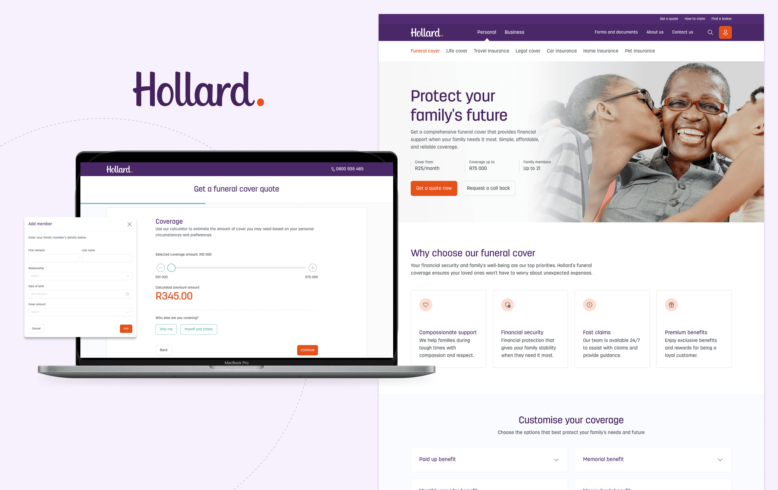
Impact
The challenge
Hollard's life insurance division needed to replace its underperforming funeral insurance platform. A complex application process was causing high abandonment and declining policy purchases, which meant significant lost premium revenue.
Hollard is the largest independent, privately owned insurer in South Africa. The goal was to let a diverse South African audience buy a funeral policy online on their own, with empathy, accessibility and simplicity, while still meeting strict business and compliance rules.
- Reduce abandonment across the quote-and-buy process
- Increase completed purchases and conversion
- Improve customer satisfaction and trust
- Lower operational costs through better self-service
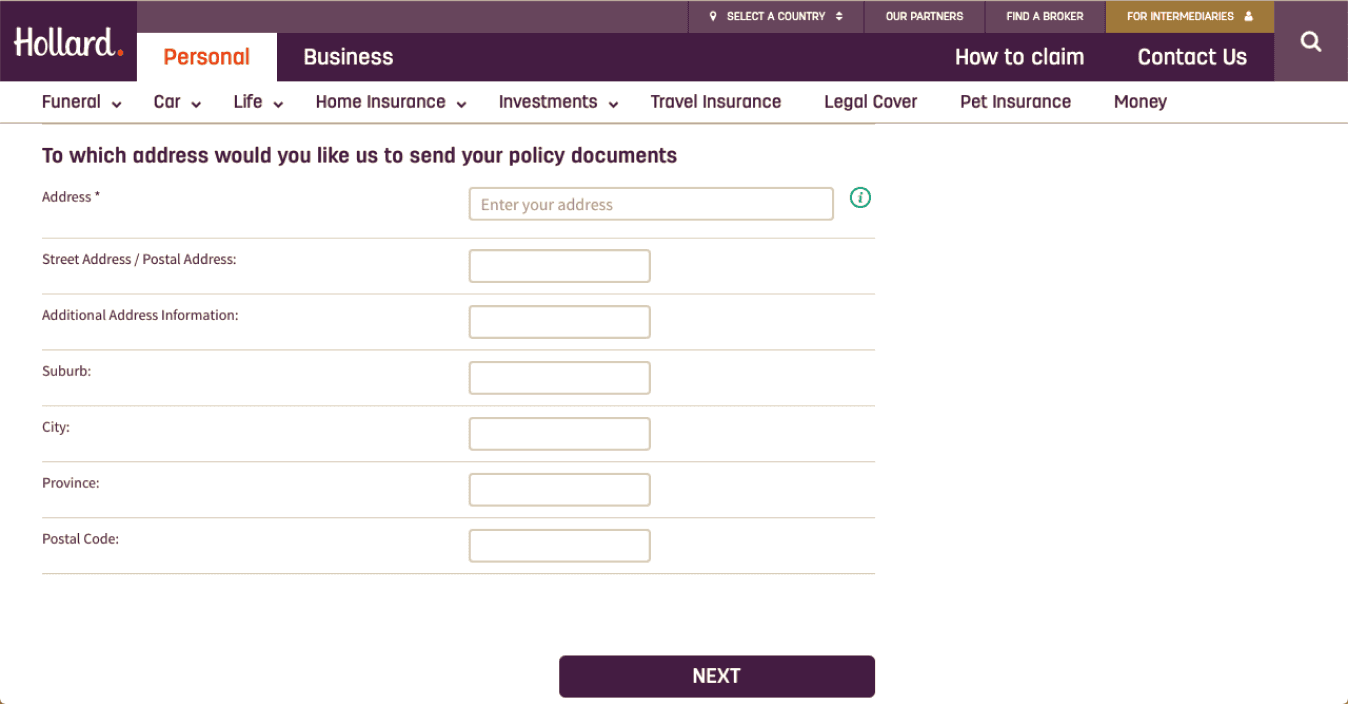
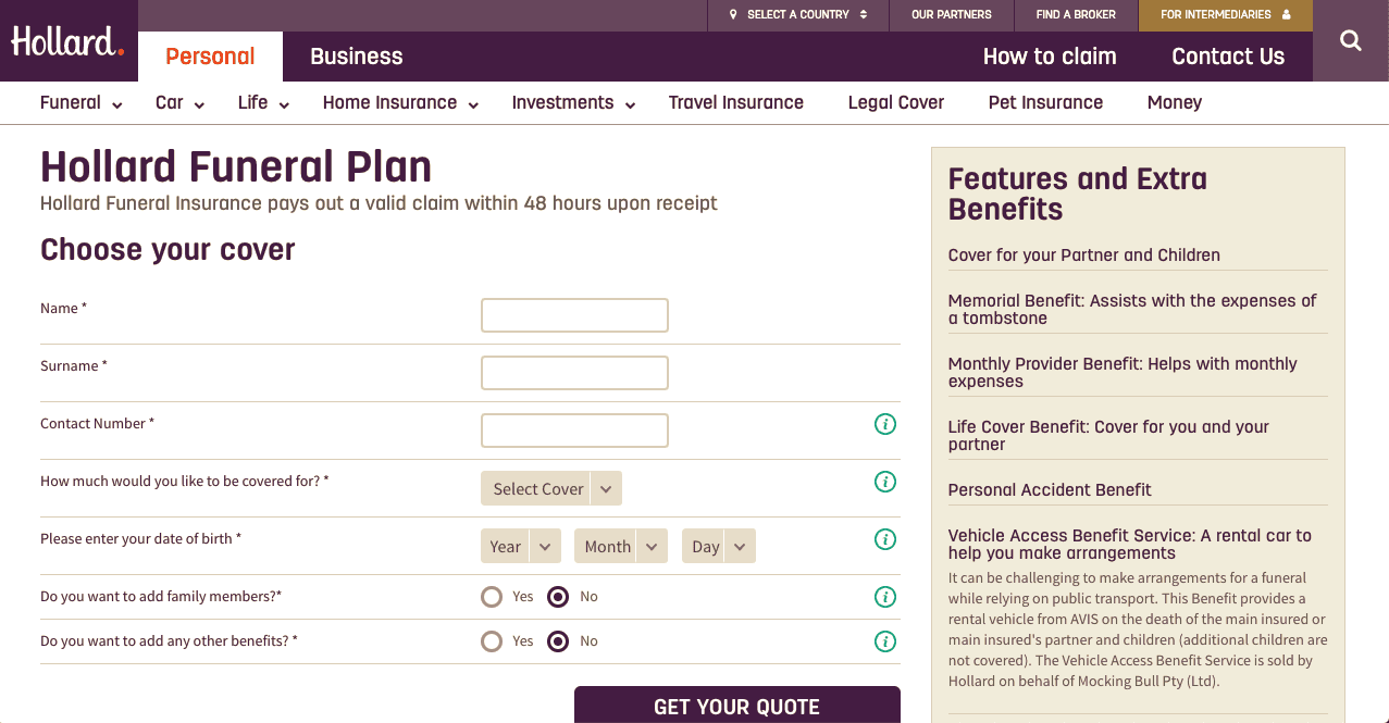
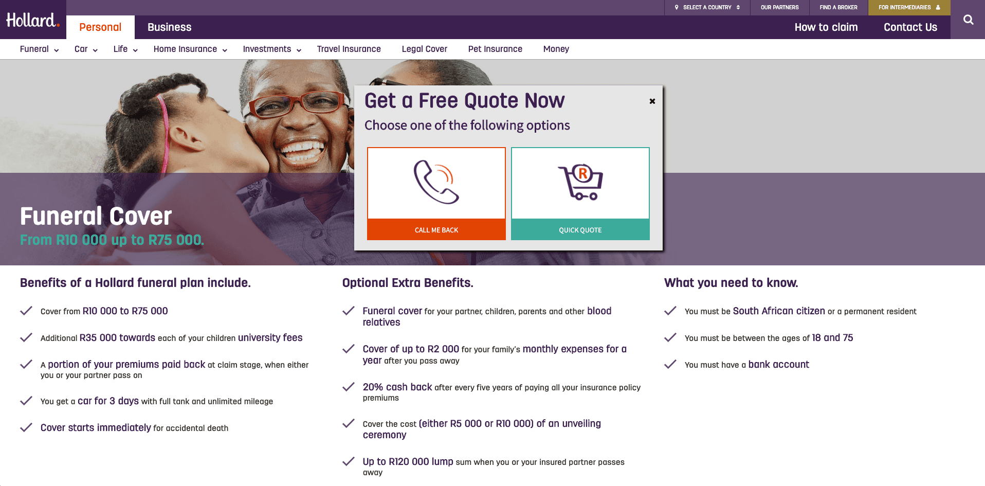
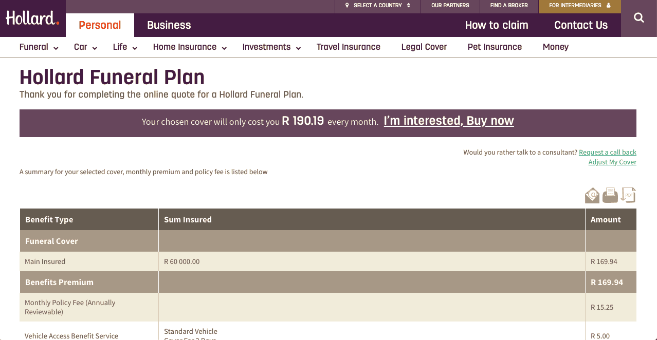
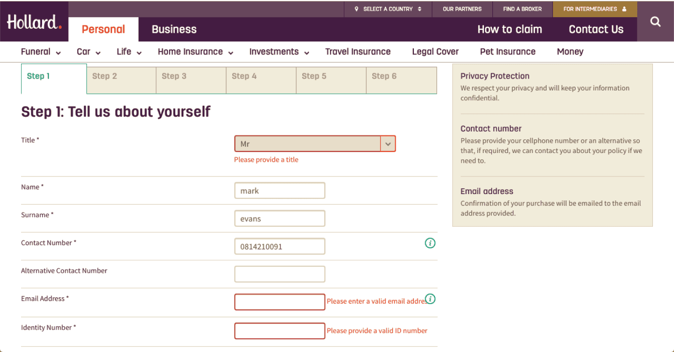
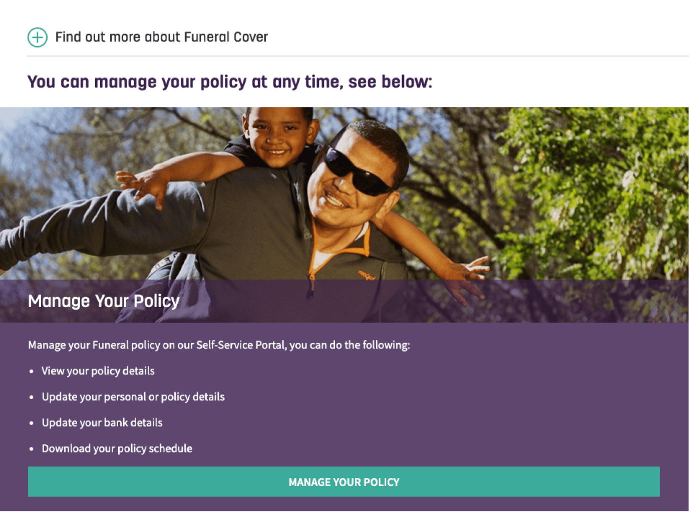
Screens from the previous version.
My role
I was the lead designer on the new quote-and-buy application, embedded in a team of a PM, a BA and seven developers, and working across business, actuaries, marketing, sales, customer service, legal and compliance.
- Diagnosis. I audited the existing journey to pinpoint where it failed at UX and UI level, and listened to customer calls to see how it really worked.
- Alignment. I interviewed internal teams and users, and aligned the design with Hollard's business goals and design strategy alongside managers, developers, analysts, actuaries and marketing.
- Design ownership. I led the redesign end to end, from discovery to the final handover.
- System thinking. I worked with the central design team to fold the new patterns into Hollard's design system, so they could be reused beyond this product.
Discovery
From ambiguity to clarity: understanding the business, the users and the competition.
Stakeholder interviews
Business objectives and scalability requirements, so the design fit long-term goals.
Heuristic evaluation
Usability and navigation issues and inconsistencies in the existing product.
Competitive analysis
Industry patterns, best practice and opportunities to stand out.
Analytics review
Customer support calls and site analytics to find the most common pain points.
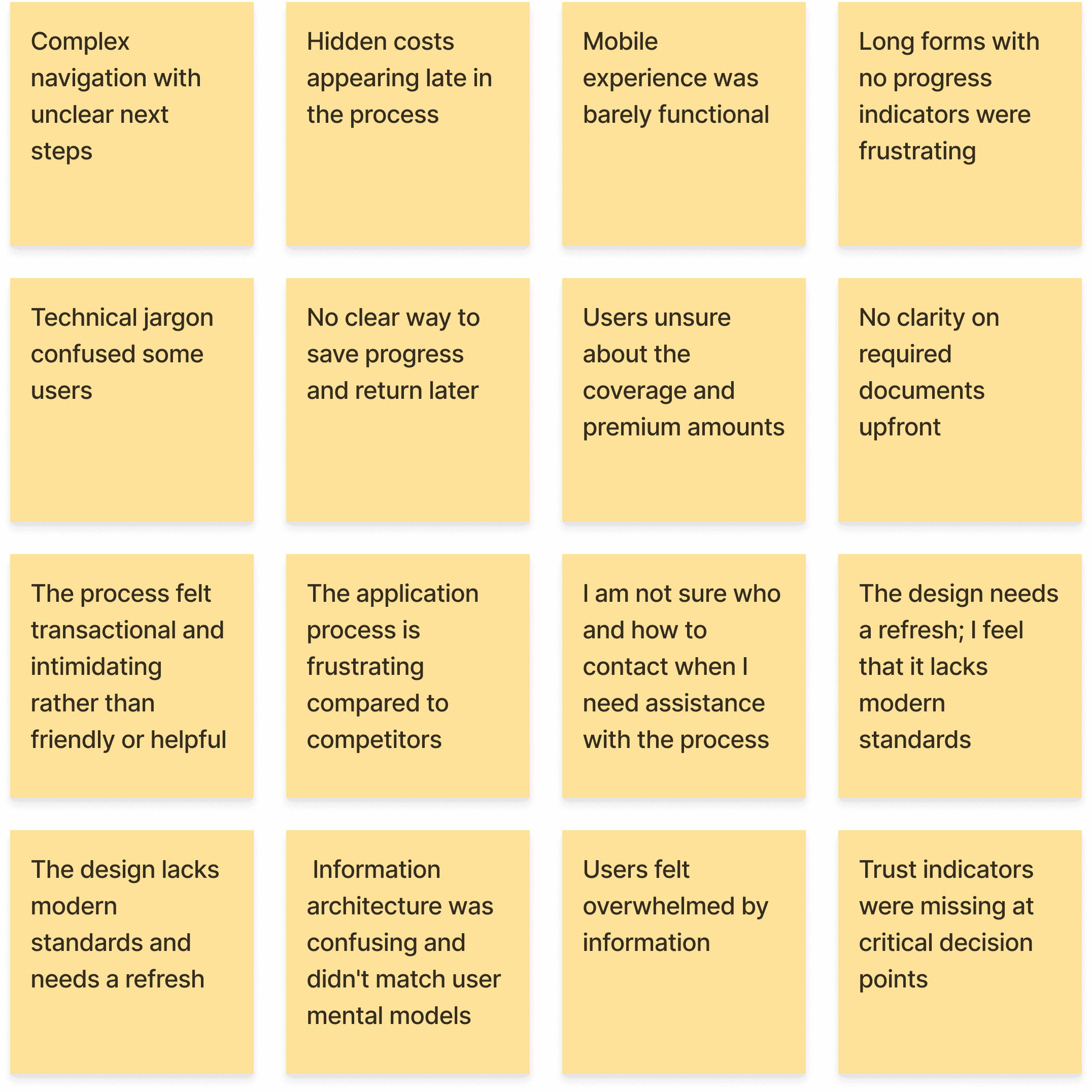
Testing the existing application, call recordings and support tickets surfaced the critical frustrations and barriers to completion.
Solution highlights
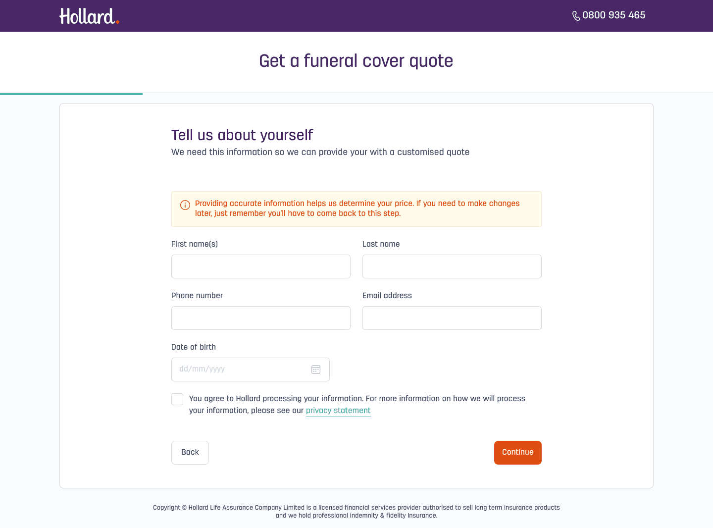
Quote first
A personalised quote up front, so people see the price and know what to expect before committing to a long application.
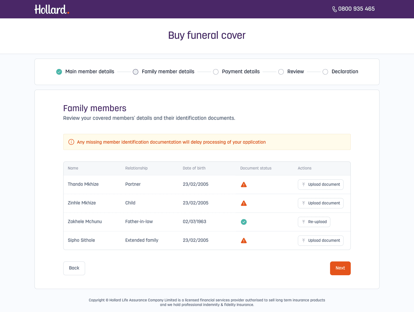
A guided four-step application
Main member details, beneficiaries, payment and confirmation, with progress tracking throughout.
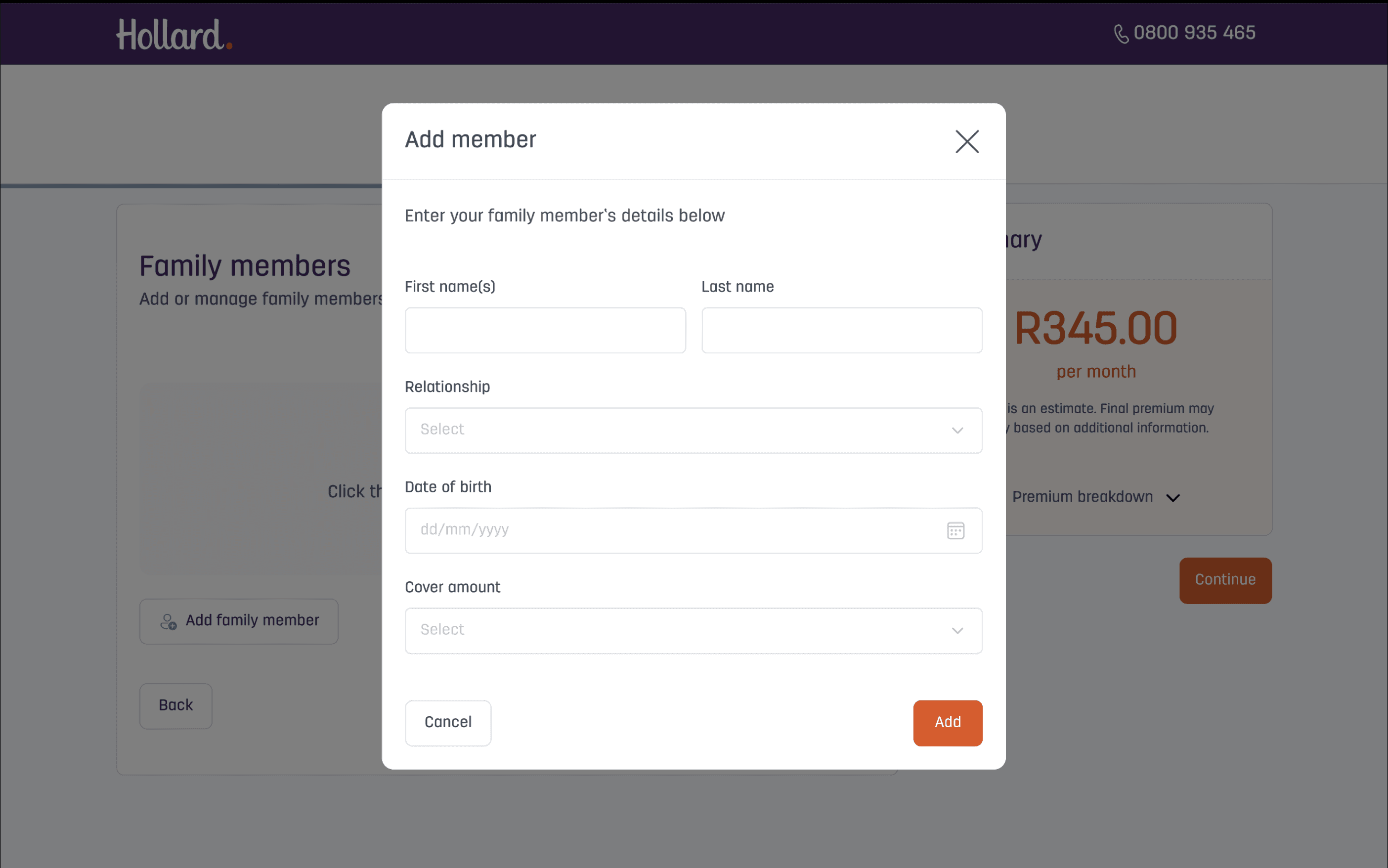
Easier beneficiary capture
Progressive disclosure shows only the essential fields first, with optional fields collapsed by default, to reduce cognitive load.
Key decisions and trade-offs
Show the price before the paperwork
People were abandoning a long application without knowing what they would pay. I moved the quote to the front so they could decide with the price in hand.
Keep compliance, lose the clutter
Underwriting needed detailed beneficiary data and legal needed every disclosure. I kept all of it, but put disclosures into collapsible sections and optional fields behind progressive disclosure.
Design around the back end
Some APIs constrained what the UI could do. I worked with developers to decide where to design around those limits and where to accept tech debt, so delivery didn't stall.
Earn trust at the moment of asking
People were wary of sharing ID numbers, so I placed security assurances inline, right where the data was collected.
Delivery
We worked in scrum, using a discover, define, create and deliver model. I owned the design handover so developers could build without guesswork: Sketch files, InVision prototypes, Zeplin specs, a complete style guide and UI kit, responsive specs for every breakpoint, and guidance on micro-interactions and animation.
Results
The redesigned journey launched on web and kiosk. Beyond the headline growth in users, sales and conversion, it was faster and clearer to complete.
Clearer guidance in the journey also reduced support calls to the call centre.
What I would carry forward
- Align early. Stakeholder alignment at the start prevents costly redesigns later.
- Earn trust. Insurance needs extra care around transparency, and showing the quote early helped.
- Plain language works. Clear explanations noticeably improve form completion.
- Progressive disclosure is very effective at reducing cognitive load in complex forms.
Opportunities identified for the next phase: saving incomplete applications, real-time chat help, linking onboarding to the policy management portal, and personalised product recommendations.