01 Momentum · Financial services
Getting clients from registration to their portfolio
Clients were registering but never making it to their portfolio. I led the design of five login and registration journeys, grounded in discovery data and two waves of usability testing, and handed a dev-ready design to Momentum.
- Role
- Design lead, via Helm Digital Studio
- Timeline
- Jul – Oct 2026 (3 months)
- Scope
- Discovery, journeys, prototype, testing, handover
- Worked with
- Product, architects, security, support
The problem
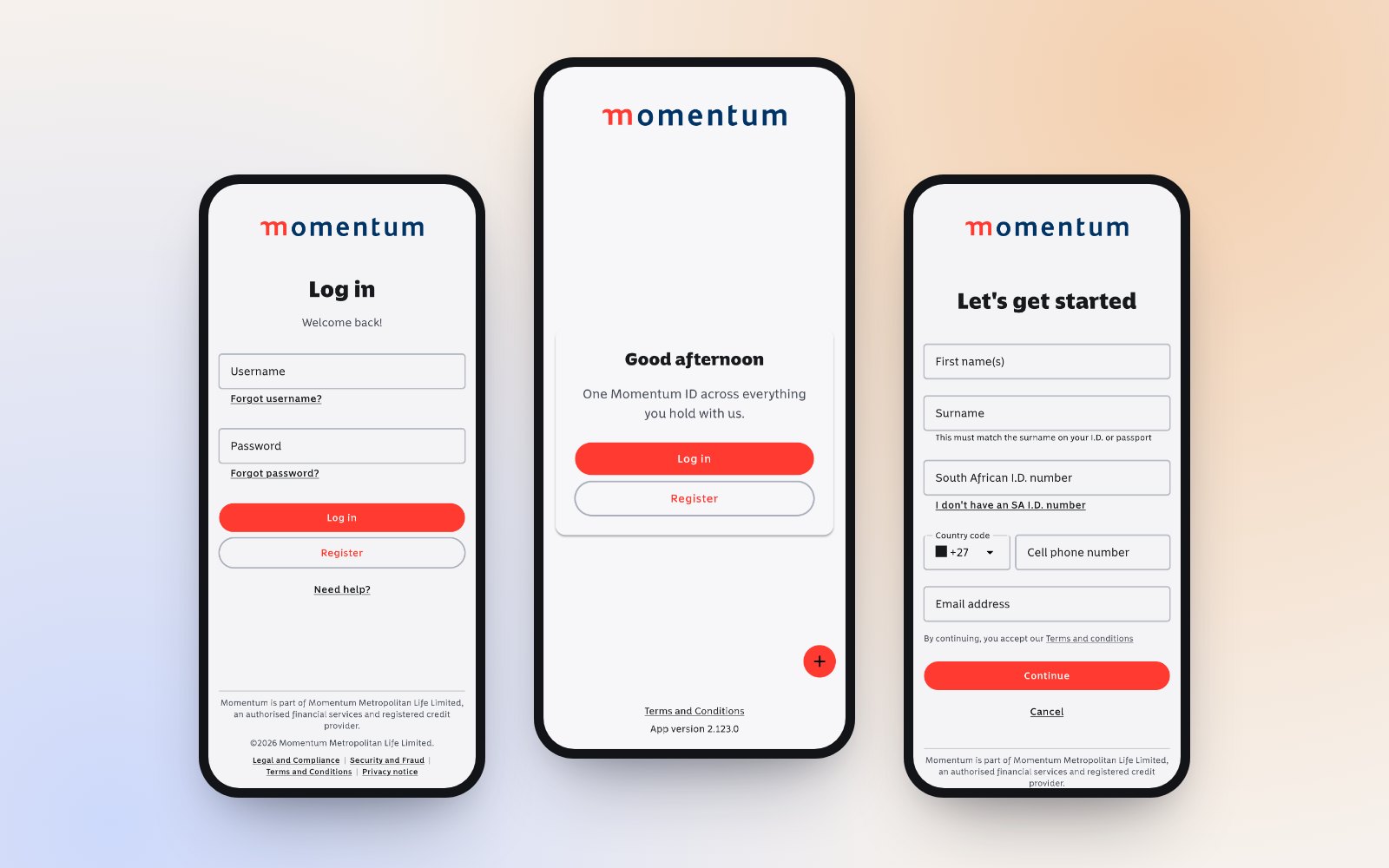
Clients were dropping out before they reached their portfolio, and when they got stuck the route to help was slow and gave them no visibility.
Discovery pointed to a handful of causes in the existing journey:
- Register, then wait. A message said activation could take up to 30 minutes, so many clients never came back to log in, even though the profile existed straight away.
- Username or email? Two sign-in conventions coexisted, so clients guessed which one to type. Login completion dropped sharply during a tax certificate campaign because of it.
- Missing products. Some clients logged in to find products missing and had to raise the gap themselves.
- Help in the dark. A support request meant three working days with no reference number and no status.
How I approached it
1. Discovery from real evidence
I combined voice-of-customer data, app store reviews, contact centre data and search trends with sessions alongside the helpdesk, the architecture group and Momentum's own UX team. We built a full scenario inventory, then agreed a priority shortlist and what was deliberately out of scope.
2. A principle that kept design honest
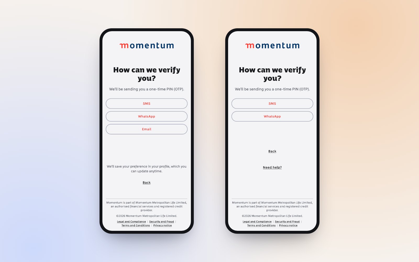
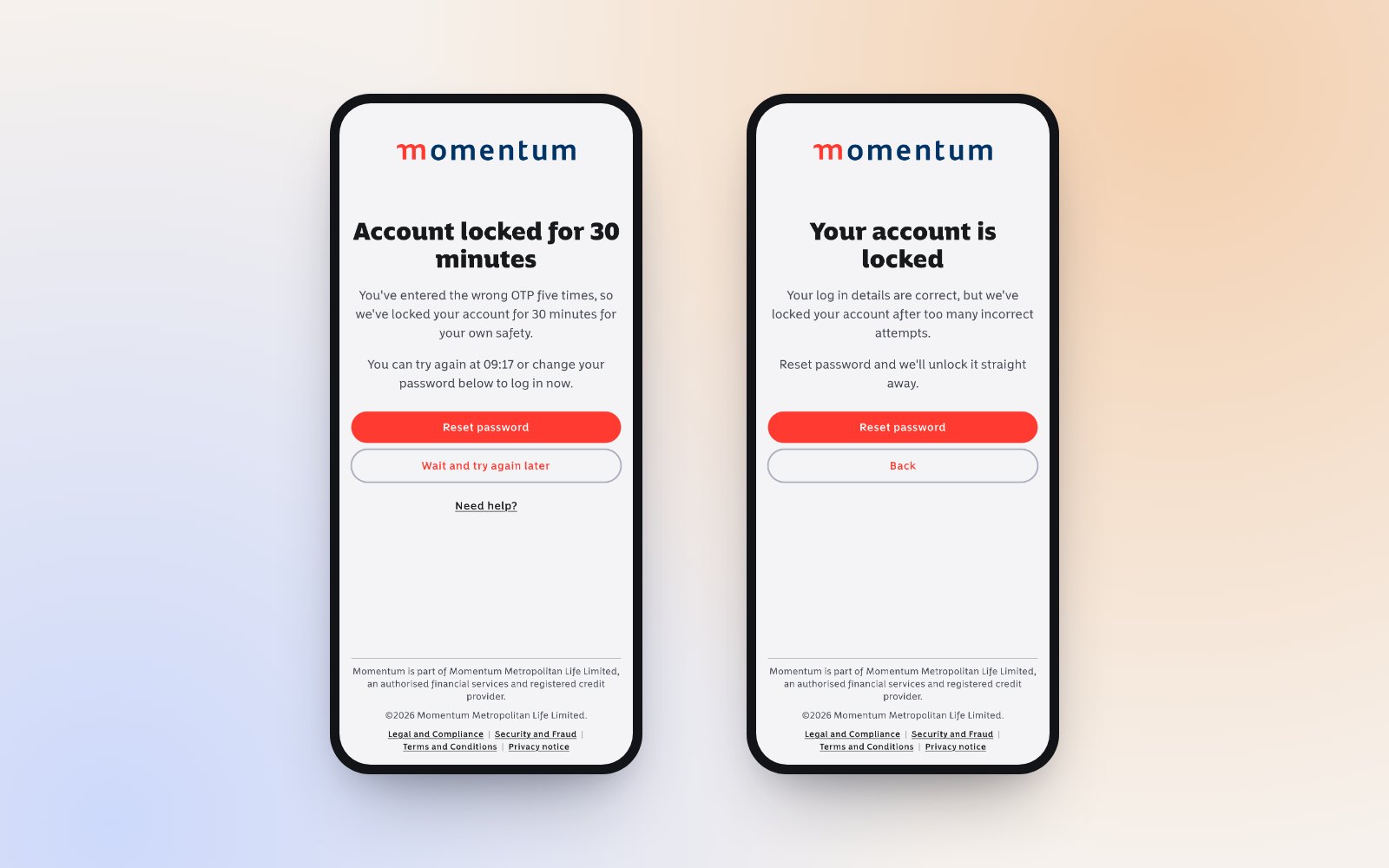
Early on we agreed one governing rule: the prototype carries the design recommendation, and technical limitations are annotated alongside it, not designed around. Every decision point was shown as a pair of screens, the recommended design next to what the platform supports today, so trade-offs stayed visible and could be prioritised.
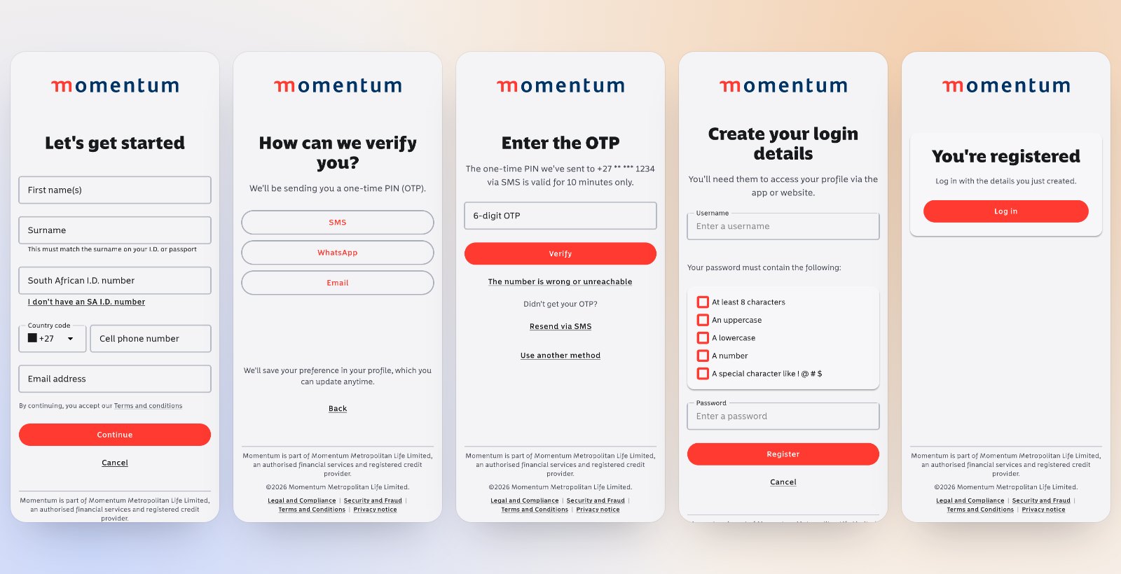
3. Five journeys, one vocabulary
- Registration through to first access
- Returning login
- Credential recovery
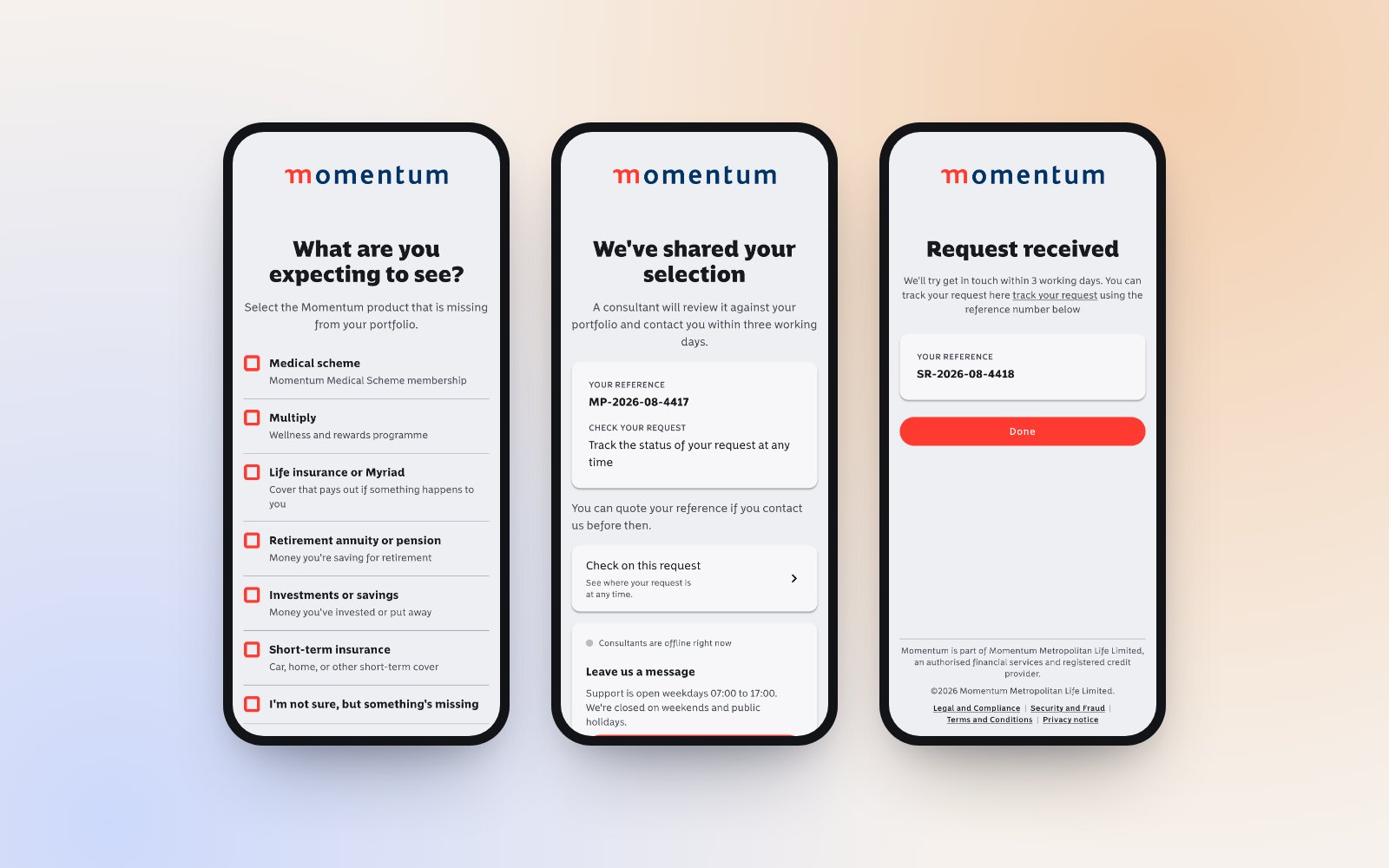
- Logged in with missing products
- Changed or unreachable contact details
Terms like "log in", "OTP", "mobile number" and "support request" were standardised across every heading, label, link and error.
What testing told us
17 moderated sessions across two waves. Participants could get through the happy path. What broke trust was what happened when something went wrong.
Three days is too long
Rejected by 6 of 7 participants in wave two, with real cases like needing access while at the doctor.
No way to track a case
Once a request was logged there was no reference, no status and no clear path to resolution.
Recovery felt like an attack
Resetting with ID and personal details felt risky, so the flow was flagged for a security review.
Missing products felt like blame
Participants felt it wasn't their fault, and didn't recognise internal product names.
Credential guidance belongs in the field
One participant typed an email into the username field, assuming it would work.
Some things worked
The password strength meter and channel choice were praised, including WhatsApp OTP for a traveller with no SMS signal.
What changed in the design
- Honest status after registration, with a direct route into the first login instead of "come back in 30 minutes".
- Support you can track: a committed support request form that returns a reference number, plus a help panel with chat, call, email, WhatsApp and progress.
- A needs-based product list that says "Life insurance" rather than internal product names, with "Enquire now" only when something is actually missing.
- Clear credential guidance inside the login field itself.
- Consent on the first screen, before any personal data is captured, to meet POPIA timing.
- Distinct locked-account and MFA-lockout states, each with its own recovery path.
Outcome
The design direction held at the stakeholder playback. The five journeys, standardised microcopy, architecture decisions and annotated trade-offs went to development in a Figma handover file with dev-ready specs. After the playback I added 26 annotations across 19 screens to capture what the room decided.
I also set out what comes next: shorter routes to a human, video help at the point of need, biometrics for sensitive changes, fewer OTP choices, and treating the username migration as its own initiative rather than a UX fix.
What I took away
Showing the recommended design and the current constraint side by side changed the conversation. Instead of quietly designing around platform limits, the team could see the cost of each one and decide what to fix first.